Building a telehealth practice website with AI: Regulated with Loreta
,4 min read
Regulated with Loreta is the website for Loreta Labode, RN, an ICU-trained nurse who now runs a functional medicine telehealth practice out of Staten Island. She is also family: Loreta is married to my cousin.
The site has exactly one job: turn a visitor into a booked free discovery call. Everything else on it exists to earn that click, or to keep the practice on the right side of the rules that come with health care.
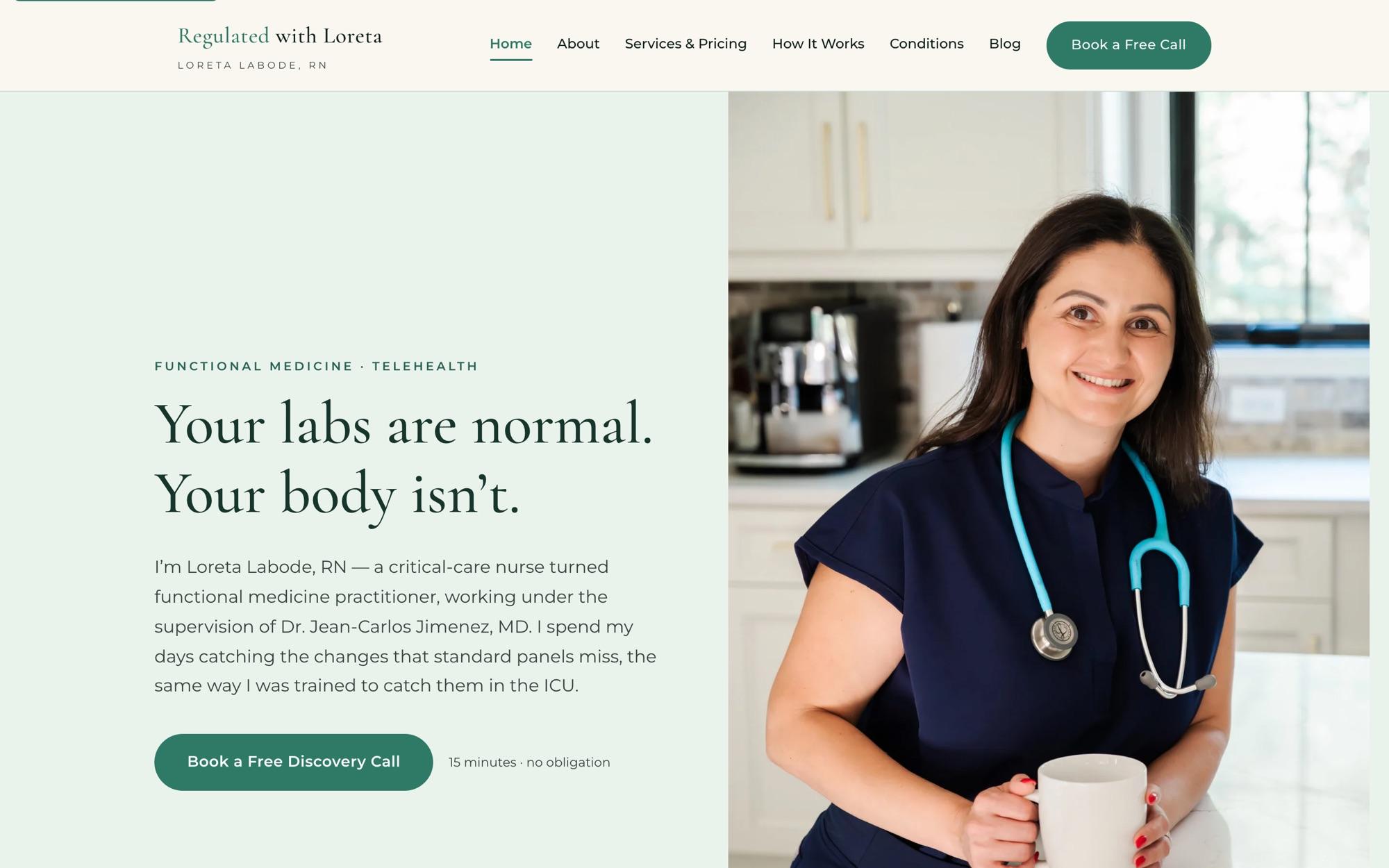
Two days of design before any code
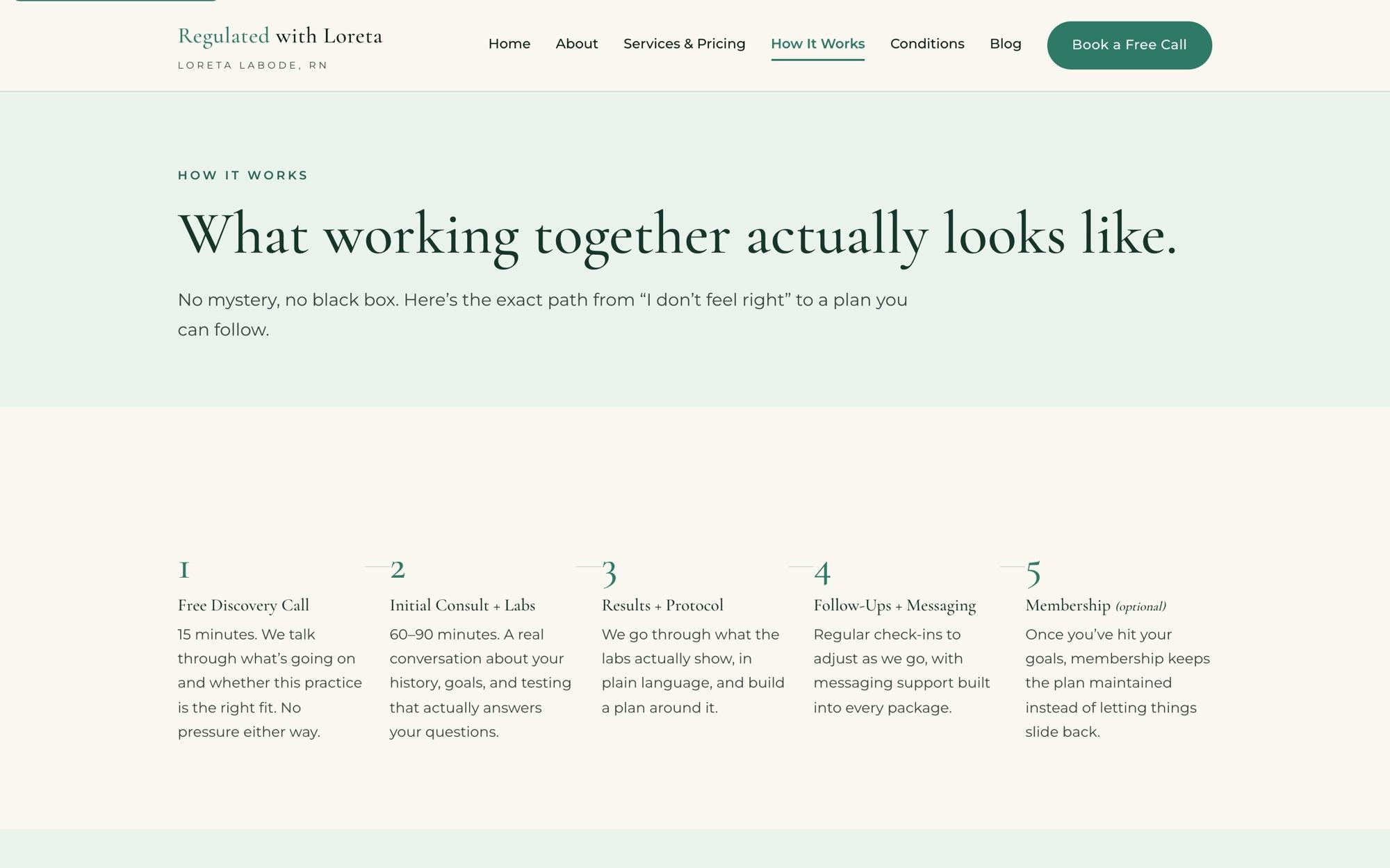
The first version was designed and written in a Claude Cowork session over two days in July. The positioning, the page structure and the copy were worked out there, and the result became a written product and design brief before it became a website.
The brief included something I now put in every project: anti-references, a list of what the brand must never look like. For Loreta, that meant no med-spa gradients and, above all, no hidden pricing. The site had to feel like the opposite of a sales funnel.
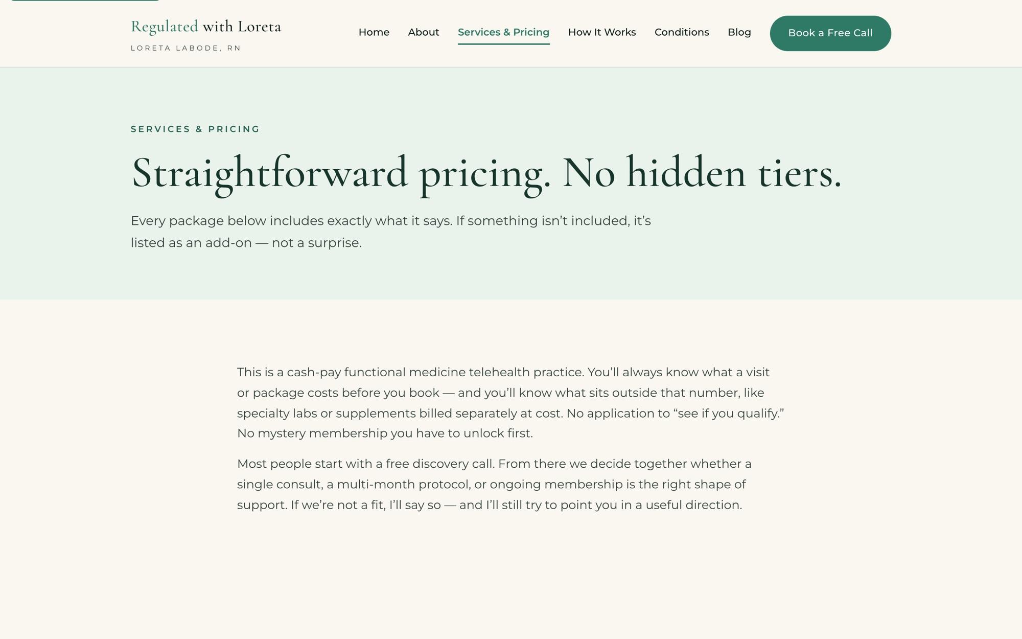
From there the site moved into Next.js, and the build continued with Claude Code and Cursor until launch.
A CMS she can run herself, with one clever fix
Loreta needed to write blog posts without calling me. So the site has its own admin area with a familiar rich-text editor and image uploads.
The first version had a hidden flaw. The site is hosted on Netlify, where the server’s file system is temporary. Posts would save, and then quietly disappear. The fix was to stop treating the server as storage at all: when Loreta hits save, the admin commits her post straight to the site’s GitHub repository, which triggers a fresh build. The repository is the blog database, with a full history of every edit for free.
There is AI inside the product too. An AI Generate button in the editor uses Claude to draft the post’s meta description, held to the 140 to 155 characters search results actually show, along with a handful of local search keywords. She writes the post; the AI handles the part nobody enjoys.
Built for a regulated business
Health care raises the bar, even for a practice of one. Twenty years in pharma marketing taught me where that bar sits, and the site was built to it from the start:
- Five legal pages: privacy, terms, telehealth consent, a medical disclaimer and an accessibility statement.
- Honest structured data. The site describes the practice and Loreta to search engines with medical business and person schema, and nothing is invented: no placeholder address or phone number just to fill a field.
- An FAQ that can’t drift. The questions people see and the FAQ data search engines read are generated from the same source, so they can never disagree.
- Consent that means something. When a visitor declines analytics, the site clears the analytics cookies instead of just hiding the banner.
- The client owns the keys. The site is hosted on Loreta’s own account. She isn’t locked in to me or anyone else.
Accessibility and security, measured
Accessibility work was specific and measured:
- The main button’s contrast went from 2.48:1 to 7.02:1.
- Small label text went from just under the line, 4.49:1, to 6.15:1.
- The mobile menu button grew from 22 by 30 pixels to 44 by 44, and now tells screen readers whether it’s open.
- An automated accessibility scan now finds zero violations across the site.
The admin area got the security attention any login deserves: signed sessions, rate-limited login attempts, comparisons that don’t leak timing, strict security headers, protection against path tricks in URLs, and uploads checked by their actual file contents rather than their names.
Then we audited it. The formal security review rated the site B+, with no critical findings. The one medium-severity issue it found was fixed the same day.
What a one-person practice can have now
A few years ago, a practice like Loreta’s would have chosen between a template site that ignored half of these requirements and a custom build it couldn’t afford.
AI changed that trade. The legal pages, the honest schema, the consent handling, the accessibility fixes and the security review are the same work a health system pays an agency to do. It just doesn’t take an agency anymore. It takes someone who knows what the standard is, and the discipline to check every piece against it.